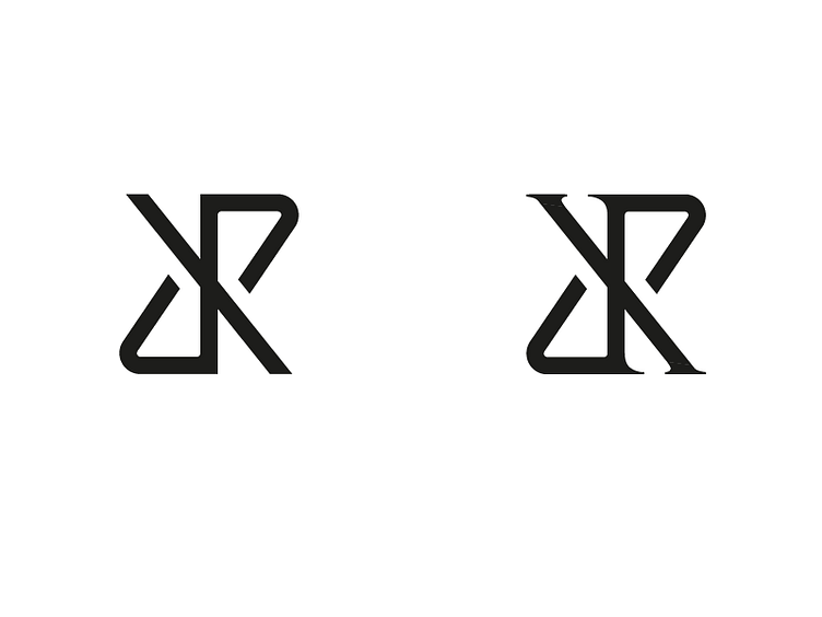
dipx rebrand version 2
So I've been further exploring my logo for the last couple of weeks and decided this is the monogram I'm going to work with. this monogram spells dipx and has this classy , creative feeling im looking for. I just can't figure out which one I like more; the sans serif one is very modern and clean but the serif one is more classy.
Which one of these do you prefer more and why?
More by Kevin van Eijk View profile
Like

