Rebranding dipx
I think is time to update my personal brand/design. I've been using the name dipx for over 10 years now and the current logo for 7 years and I think it is time to change ;)
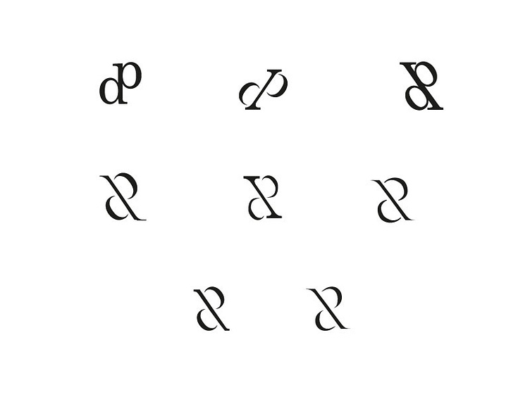
I'm trying to get a more classy, creative and loyal feeling for my personal brand. The super simple sketches you see here are the first digital version of the sketches I made on paper: https://twitter.com/dipx_design/status/929323335569362944
I've made a moodboard you can check out over here: https://twitter.com/dipx_design/status/925822970353868800
what do you guys think of this? I'm I heading in a good direction? Is there any potential in one of these sketches? Which one do you like the most, and why (or do they al suck)?
Im trying to fit in all the letters (dipx) in the design, but some aren't that easy to see.
Hope to get some feedback!
