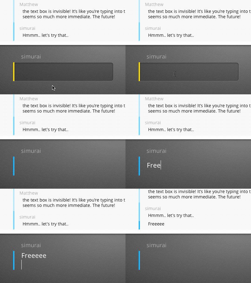
Let it breathe
I really liked Matthew's idea of removing the "input look", once you focus a text field. It frees up the claustrophobic feeling and lets your typing give some breathing room. Also the UX doesn't get compromised because in the unfocused state it's still screaming: "Hey, I'm a text input, click me".
So it's now also on tlk.io. But we still have to add that the text field grows when you type more than one line, otherwise it's not really freeing. ;-)
letitbreathe.mov
2 MB
More by simurai View profile
Like

