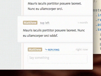
Post-it comment
@JesseDodds once said he found pushing pixels in tiny icons soothing. I think I can say the same about fiddling with animation timings. I could spend all day getting it just right. You’ll definitely want to watch the video version.
This shot’s got a lot of things I’m pretty happy with:
• the text box is invisible! It’s like you’re typing into the website itself. It seems so much more immediate. The future!
• Enter-to-post. It makes it much more IM-like. And cleaner.
• The animation reminds me of peeling off post-its. It’s delightful and and quick enough to not be intrusive. I like the metaphor: you’re not typing into an abstract text box which inserts text over there; you’re typing your comment and this is it moving.
More by Matt Pistachio View profile
Like
