Basic UX tricks for big data tables. Part 3
▶️ See the Attachment for better quality.
______
The first part
The second part
____
Hey mates,
Here's the third part of the publication about basic features that will improve users' experience of working with huge data tables especially when it's impossible to avoid horizontal scroll.
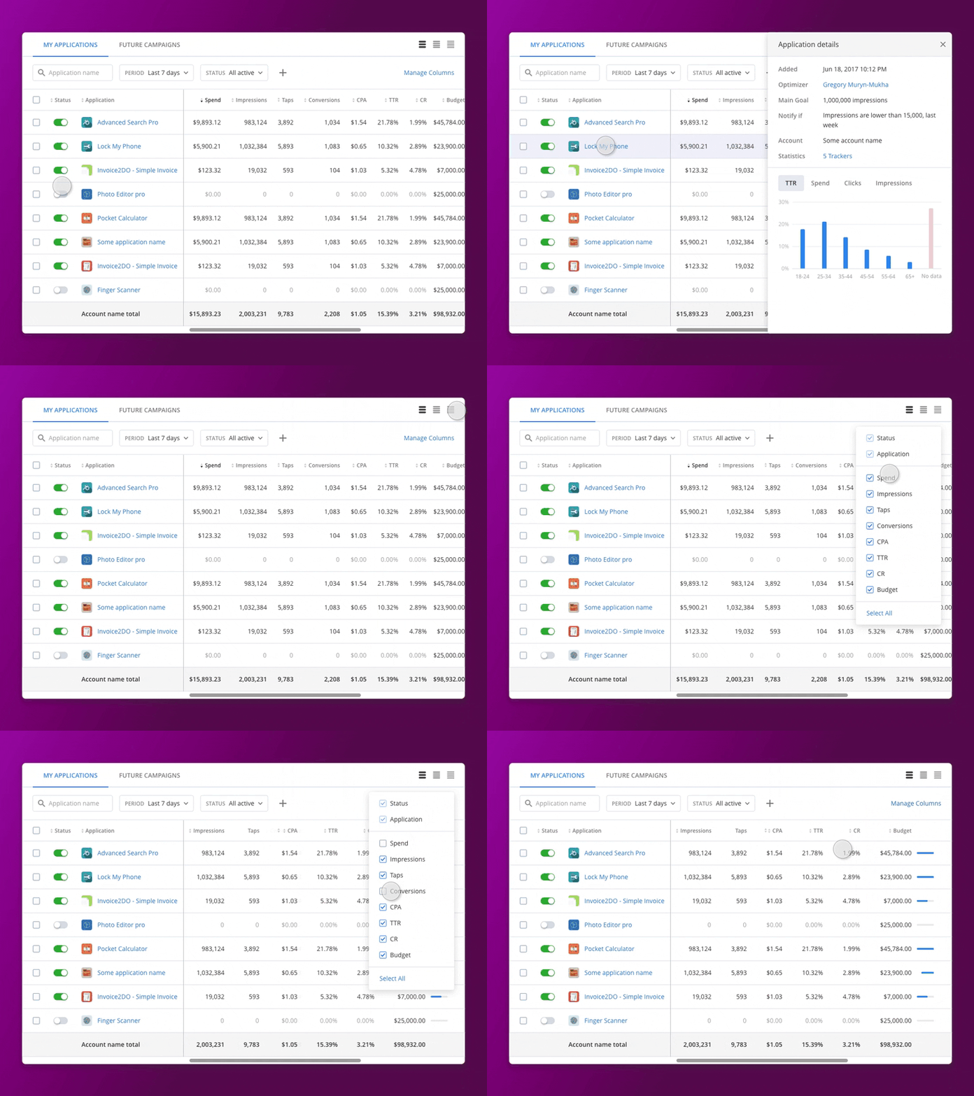
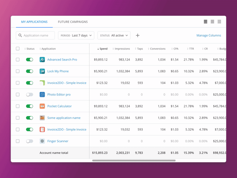
The shot contains example of expandable rows with displaying right sidebar instead of classic vertical expand and manage columns functionality that provides users with possibility to see necessary data only.
I hope that this experience will help somebody who has faced the same challenge.
____
ux_datatables_3_-_preview.mov
3 MB
More by Gregory Muryn-Mukha View profile
Like

