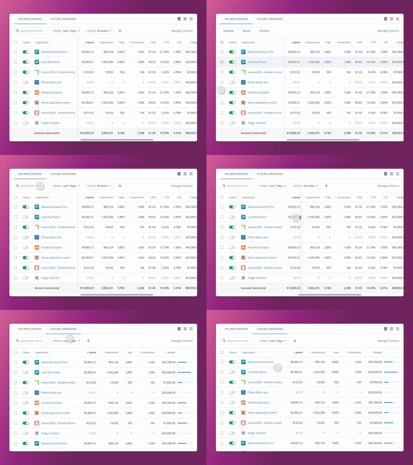
Basic UX tricks for big data tables. Part 2
▶️ See the Attachment for better quality.
______
The first part
The third part
____
Hey guys,
Here's the second part of the publication about basic features that will improve users' experience of working with huge data tables especially when it's impossible to avoid horizontal scroll.
On this project I've faced the situation when there was no way but displaying data tables with more than 20 columns (because of users' needs).
So I've decided to provide users with possibility to customize their workspaces by adding tabs like we used to work in regular web browser.
And each tab saves it's own filter, displayed and hidden columns and sorting settings and users will no longer need to reset or edit the filter settings in order to switch between different items.
In this shot these tabs are displayed above the data table but without the possibility to add new ones.
The shot contains example of bulk actions, editable frozen area using drag-n-drop, and fixed header while vertical scrolling.
I hope that this experience will help somebody who has faced the same challenge.
____

