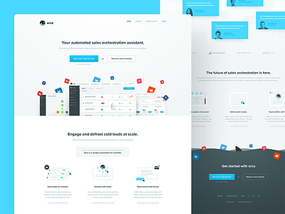
the landing page
Another shot from the Orca series – take a peek on the initial shot (with the logo) for more info on the product.
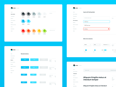
One more thing I wanted to show off before we go for the crème de la crème of this project, by which I mean the product interface itself. What you’re looking at is Orca’s landing page, one of the few variants we prepared. There were quite a few challenges here, not just keeping things consistent with the rather raw UI of the product, but first and foremost, making sure that the point of Orca gets across and is easily understood, even by people who wouldn’t be described as very tech-savvy. Will be interesting to see the conversion rates, once this launches.
For now, you can get started using the alpha at www.useorca.com. More to come tomorrow!


