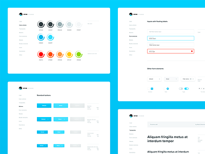
the style guide
Another shot from the Orca series – take a peek on the initial shot (with the logo) for more info on the product.
After we got the logo approved, we started working on the brand manual and an user interface style guide, which is pretty much a library of interface elements used consistently across the product. It really comes in handy once the developers start doing their wizardry, making their lives easier, and because of that, lowering the dev time & cost, which is something a client is always happy to hear.
When we were brainstorming the brand identity, we saw two approaches. First, a half-orca half-killer robot with laser eyes, the kind of AI that Elon Musk warns you about. Black, red with a general vibe of being badass, on the verge of (evil👺) singularity and so on… In the end though, we went with the second approach - something fun and approachable, so light and vivid colors, a soft sans serif font, and a friendly vibe. CandyCrush almost got into the mood board there (yeah, I know).
As always from us, it’s a real product, and you can get started using the alpha at www.useorca.com.
Not much else to say there. Tomorrow though, we’ll get started on the actual interface on the product. See you then! 🙌


