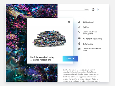
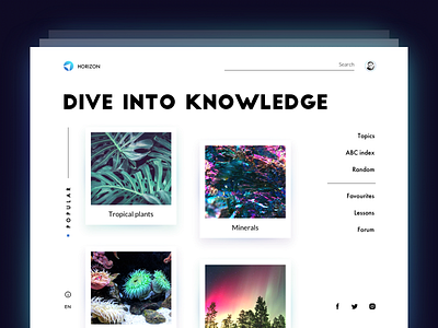
Encyclopedia Website: Entry Page.
Knowledge is power, and that's cool to live in times when it's easier to get it than ever before. Today we continue exploring the theme of UI for education. Recently we showed you the design concept for the home page of an encyclopedia website designed in a minimalist manner. This time the shot features the page of the particular entry from “Minerals” topic. The card shows the theme image and brief fact file, enabling users to continue exploration reading the full description or watching the video. Also, users can share the entry to the social networks and save the card to favorites. Next shot will show you animated interactions, so don't miss the updates. Credits on UI concept to Olga Popova.
To share more ideas we get working on design projects and concepts, we regularly update Tubik Blog with new articles. One of the latest posts is devoted to creative stages of design for branding. Join in!


