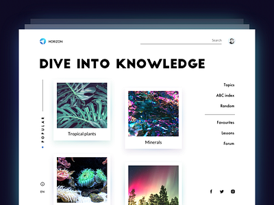
Encyclopedia Website: Home Page.
Hi guys!
“An investment in knowledge pays the best interest,” said Benjamin Franklin and it's hard to disagree. We have already presented a couple of interfaces for education here and would like to add another one. Here's the design concept for the encyclopedia website: this time it features the home page designed in a minimalist manner. Users can see the most popular categories, type the needed term in easily found search field placed in the header, or interact with different content via side menu on the right. Next shots will show you the page of a particular entry and animated interactions, so don't miss the updates. Credits on UI concept to Olga Popova.
To share more ideas on design process and strategies, we regularly update Tubik Blog with new articles. One of the latest posts presents handy typography tips for UI designers. Join in!

