The Makeover landing v.03
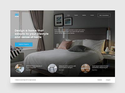

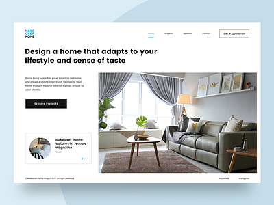
Continue to test out another layout again. This time, I made the content elements overlapping on the background image, and play around within the container. The important point to take note is that the chosen of background image display has to be as simple as possible, to avoid the messiness and cluttered outcome, as the content should be readable enough matches with the visual.
I personally like the arrangement of 3 blurps underneath featuring the latest updates. It looks more professional and straight to the point without any fancy slider that only able to display one at a time.
L