The Makeover landing v.02
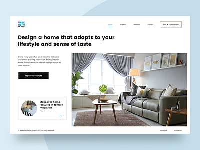
Challenge myself with another design approach, I prefer this version as it's more organized and spacious in terms of the content arrangement. The white color background also makes the layout looks more crisp and clean.
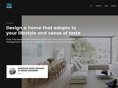
The common layout that we have seen today is the overlapping content on top of the background image. For this design, I don't want any elements to distract the beauty of interior's visual. Hence, let it sparks and creates the visual impact. :)
L
More by Four Fries View profile
Like


