Lix Logo - Part 2

Lix: Logo Redesign - Part 2.
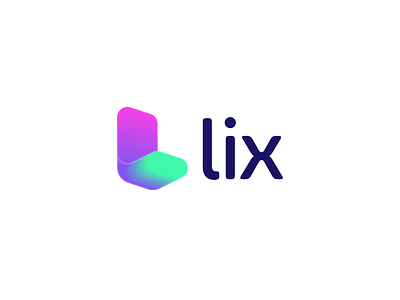
For this new concept direction I kept with the letter L as main icon for the mark. My task was to discover a creative and less corporate looking identity and use more vivid and bright colorings.
Happy to hear some of your thoughts, possible critiques and/or love. Also check out the attached file for other color directions.