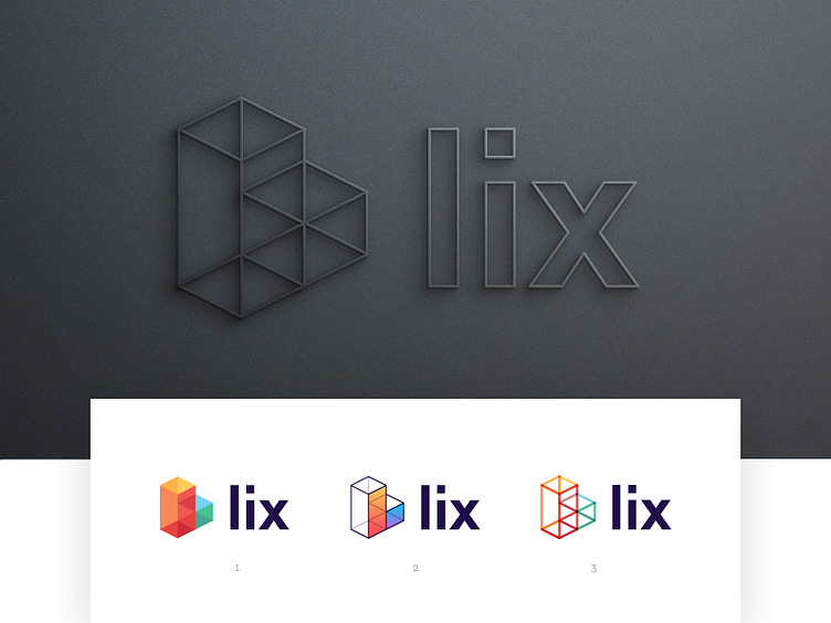
Lix - Logo redesign.
First logo redesign concept iterations for the @Lix identity.
Made this isometric shape of the letter L and included elements that refers to the Lix service. Below are the elements that are used: - Letter L - Transparency - Bright colors (happy vibe) - Learning (blocks and steps)
Would be great to hear which one would be your favorite and why. Thank you all so very much for the kind support during this project!
_ Lix is a study space for university students, where you get your books cheaper, digital and with all the tools you need to get through your studying with ease.
More by Lix View profile
Services by Jeroen van Eerden
Like

