Unused Homepage Concept 002
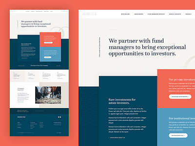
Here's where we went next from this previous direction. After the first concept, our client revisited their brand to allow for a more vibrant colour palette, where a coral and light blue were introduced. They definitely brightened the design!
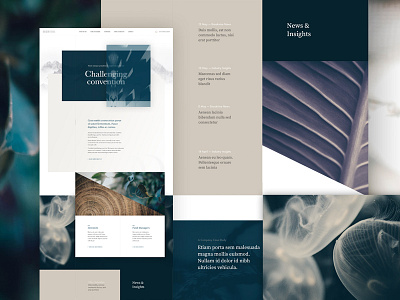
The new direction needed to align more closely with what was expected from the industry, based on their key audiences; there was a general consensus that the original concept was too spacey, making it a bit tedious to access only a small amount of information; and based on individual preferences we looked at steering away from imagery, only using images in places that called for it, such as accompanying a case study so the cows have some relevance, I promise. 😅🐮
Certainly an interesting deviation from where were started and not the final direction, but this marked the beginning of the 'right' direction for the client.
---


