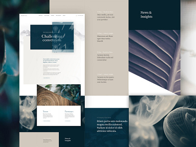
Unused Homepage Concept
Some concepts are only meant to live on as just that - just concepts ✨ Here's a direction that went unused for one of our current projects. I really tried to push the boundaries of the typically corporate aesthetic, for a typically corporate field - financial services. I imagined an intermingling of animation and type, and was excited by the unconventional approach to imagery and the muted colours which were led by the company's brand. Sadly we had to go down a different path, but I still think this deserves a mention!
(Sorry about the lorem ipsum! 😬)
---
More by Humaan View profile
Like

