Hout van Deisz


Approved Logo Design for a friend who makes high-end side tables out of sliced wood.
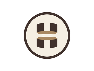
With the help of the talented @Damian Kidd this concept went from smart to even smarter and more minimal. The idea of this concept is to visualize two wood slices that shape into the letter H. It also has a little optical illusion going on which makes it just a little more special imo.
Happy to hear your thoughts and thank you all for the fast round of feedback on the previous post. Check the attachment for some of the logo variations.