Payment App - Microsoft Fluent Design
Hello Monday!
I see @Ghani Pradita shot about fluent design and can't handle myself to take on the exploration too.
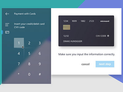
So here it is, an exploration of a payment app using fluent design principle of 'light'. Light create a sense of place and atmosphere. Thus it is good for illuminating informations.
Bravo to the team of @Microsoft for this. . :D
see the system in action HERE
Cheers. . :D
More by Dimas Wibowo View profile
Like


