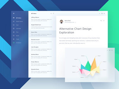
Fluent Design Email App
Hi guys, it has been a long time since I pushed my last pixels on dribbble :D
Few days ago, Microsoft introduced their new design system called Fluent : http://fluent.microsoft.com/
This time I decided to exploring fluent style to practicing my skill. Fluent looks amazing, especially the way it combines 3d and blur effects. The only thing that I don't like is the bold text, it just looks too heavy in my opinion :D
3D chart inspired by @Lukas Bischoff
Feel free to leave feedbacks :)
More by Paperpillar View profile
Like

