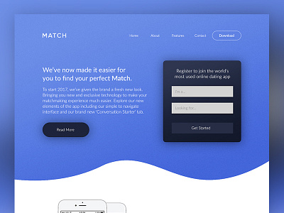
Match Homepage Amended
After the shot I posted earlier which some of you may of seen, I had another look at the testimonial section. I wasn't happy with the typography layout by the side of quotes so, I've rejigged it.
Check the attachment for the full res version and let me know what you think.
More by Adam Sidaway View profile
Like


