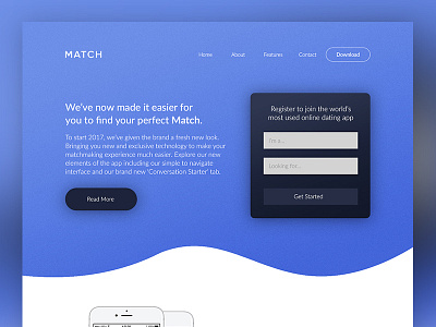
Match Homepage Concept
Been looking into Match.com as a whole and I really want to keep progressing with this rebrand, even though I've published the project.
The website allows you to login to your account and brings up a new interface completely separate to the app. It caused me a lot of confusion and it was so busy, I didn't know where to start looking.
I wanted to redesign the homepage to push for potential new users to only download the application and completely remove the login section and interface to the website.
Let me know your thoughts!
More by Adam Sidaway View profile
Like
