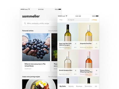
wine app interaction
Another shot featuring the “uber for wine storage” thing I’ve been working on. I’m happy how it turned out so naturally the next step is to add a layer of eye-candy, in the form on unobtrusive transitions and animations. It’s super easy to overdo it and make things annoying for the end users, but I hope that’s not the case here. Is it? :)
More by tonik View profile
Like

