Passive Systems Logomark
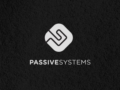
Took the orginal mark, seen in earlier 'shots' and have reworked it slightly. Decided to create something more 'curious' than an obvious letter 'P' with cute 'S' tucked inside. Even though the 'P' and trick 'S' is still there, just by extending out the open lines, it creates quite a different feel. It's certainly not so obvious now that it's formed from the initials, but that's intentional. The 'S' shoots of top left and the 'P' shoots off bottom left.
This is playing more on creating a contained emblem of sorts, that can be easily applied to their equipment and products. I think this helps give the outline idea more meat, and now doesn't look so lost or fragile.
There is still a vague link to electronics and chips with the styling and shape of the lines and container, with also a 'directional/GO' element purposefully created. It's not symmetrical, and I think this is actually what gives it this curiosity. It doesn't look wrong, but it just looks 'hmmmm'. Can't really describe what i mean.
Further styles can be viewed here
Feel a lot lot better with this revision, feels solid and clean. Also some potential for some eye candy/polish now within the container if required.
Few of these changes created off the back of previous comments so once again, thanks for your input, greatly appreciated.

