Mountune – Menu Interaction
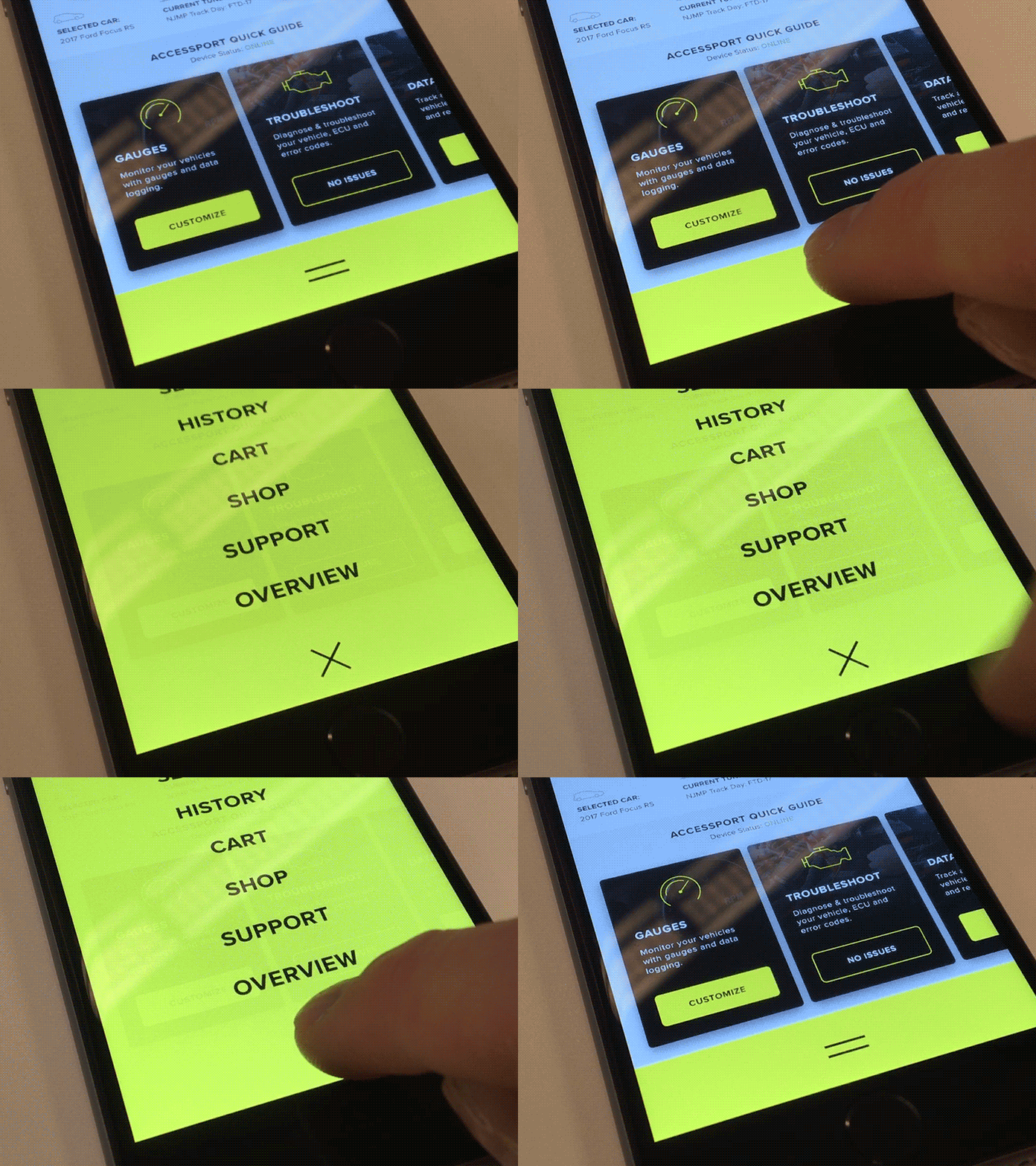
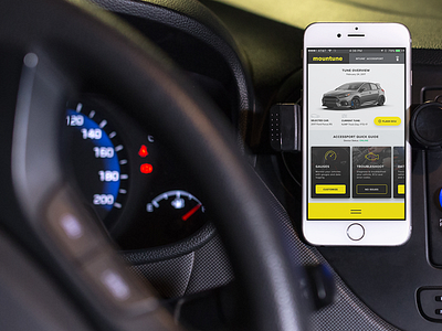
Hello everyone – Today I was messing around with the menu interaction for the Mountune app concept i've been working on.
The point of this menu is to be easily accessible from the bottom of the screen where most of our mobile interactions take place. I wish more user experiences were like this personally – having to reach up top all the time to access a hamburger menu is tedious (#firstworldproblems).
Let me know what you think – more coming soon!
Follow me on Twitter @rynduffy
Behance | YouTube | Instagram | LinkedIn
ryanduffy.co © 2016
More by Ryan Duffy View profile
Like

