#14 | Green Blog Home | .sketch
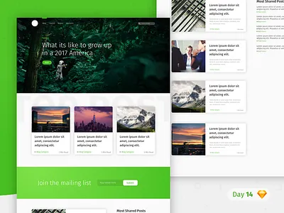
Today I decided to create my take on @Unity's medium re-design.
I made a few crucial changes. First of all I kept most titles in a heavy bold font, I did this to improve legibility. Secondly I only created two visible sections, as I think having more would simply be consuming. Finally I emitted the slider in the hero area, as people rarely pause to pay attention to these. I haven't included the footer as I envision the blog as having an infinite scroll.
As always the sketch file is attached.
Press "L" if you like the post and would like to see more like it. Finally, do let me know what you think of todays efforts in the comments below.
blog_day_14.sketch
200 KB