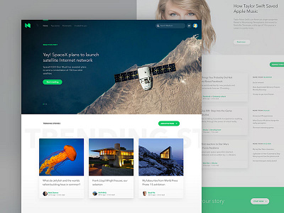
Medium Homepage Experiment
We decided to do another experiment. This time we took medium.com homepage and wanted to see how it would look in a layout that's closer to a magazine.
The idea was to break current linear layout into sections to give more options for users to explore and for editors/community to emphasise content.
Shot by @Ante Matijaca
More by Profico View profile
Like

