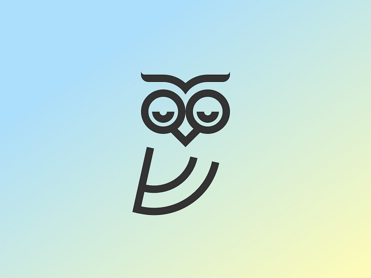
Sleepy Owl
Second round revision for this identity project.
Feedback was that some of the early concepts looked too similar to a wifi or RSS symbol. The weight of the body in the first version also distracted from the owl's face. (And I didn't tell anyone this, but I realised that body was totally an upside-down North Face logo.)
So here's a new version with those things addressed. I also raised the owl's eyebrows just a touch to give him a friendlier demeanour.
More by Dylan Smith View profile
Like

