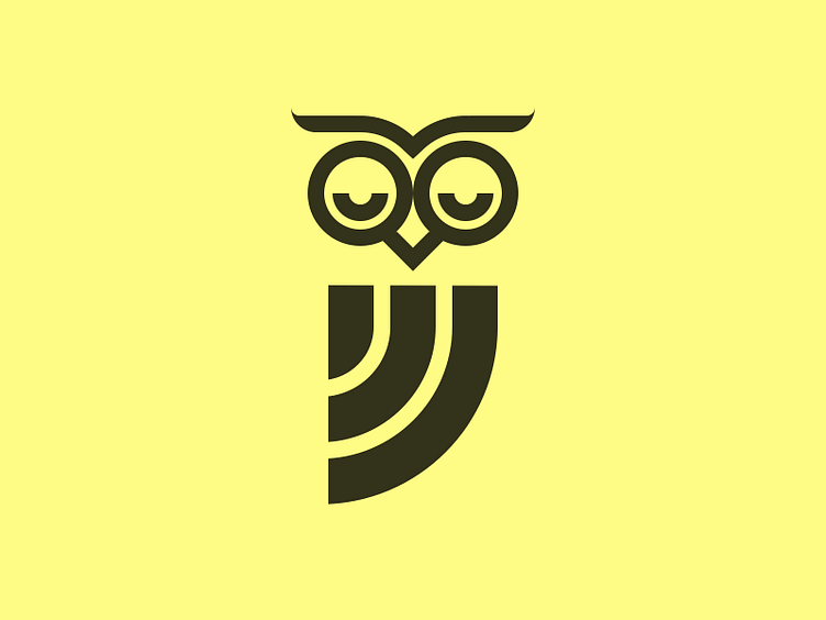
Sleepy Owl
This is my favourite of the initial concepts for the Sleepy Owl rebrand.
Their current logo is a very minimal representation of an owl, which is a style they like, but it looks amateurish. As Sleepy Owl is India's leading cold brew coffee company, they need an identity that invokes leadership and progressiveness. They also want their logo to be simple but with an edge of playfulness.
Does this fit the bill? Open to all sorts of feedback!
More by Dylan Smith View profile
Like

