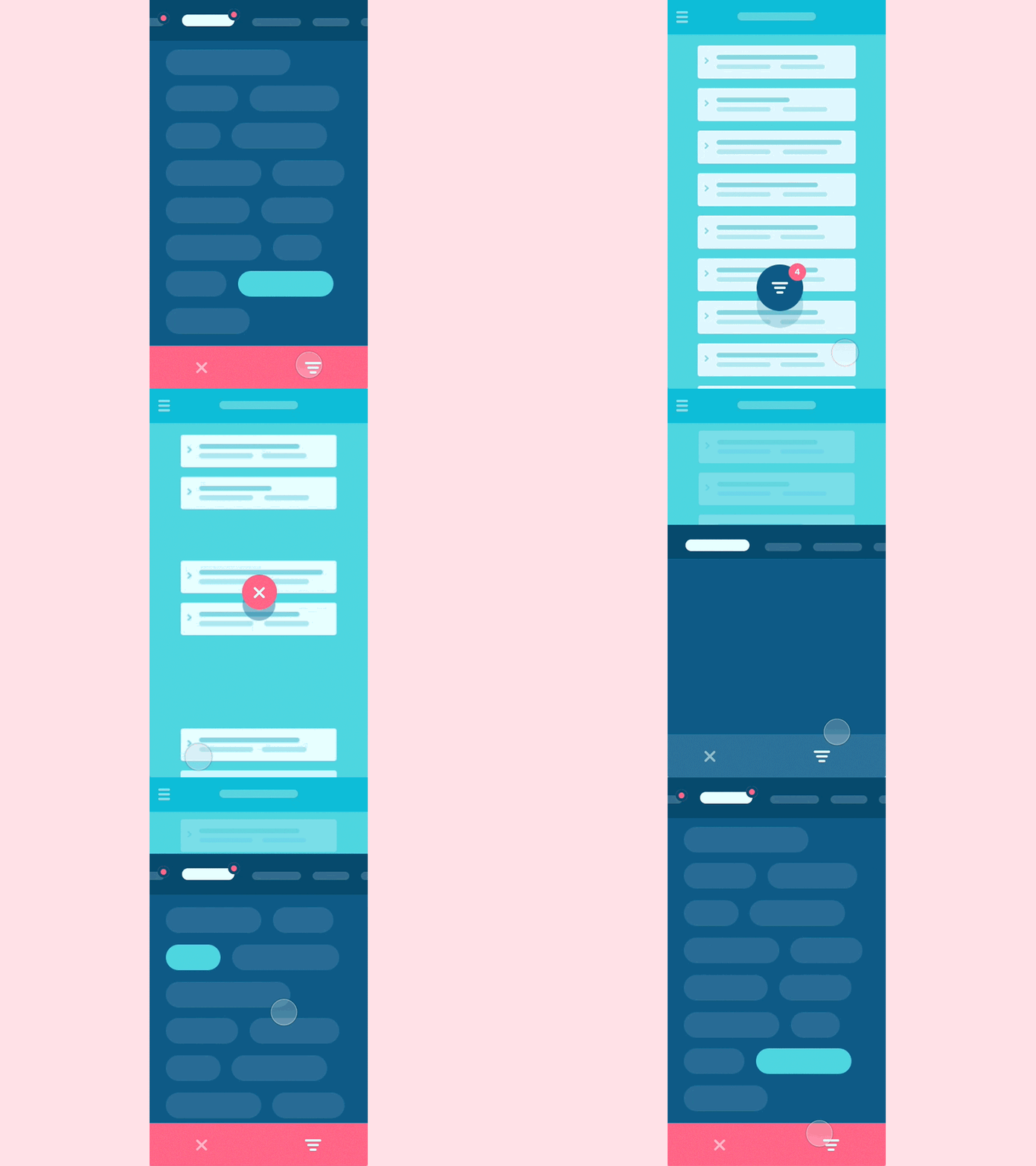
#5.2 Filters
Hey folks,
At my previous shot i tried to cover filtering, but there was too much extra stuff i wanted to show and so could not fit the gif length. So given numeric requests i decided to dedicate one more shot to it. This time i'm focusing purely on filtering, no expending plates, extra scrolling etc. Even so animation had to be pretty fast to include all the case, so sorry for that :)
I thought this pattern might be worth of your consideration. Within the panel, we can have as many tabs (each stands for separate column or data unit) as we need and when internal filtering adjustments don't fit the section vertically, we can always scroll that down at it's represented above.
This shot is being a part of so called interaction library, launch of which's been announced at my previous post. Interaction library would aim a few main targets: - Quick access to the example of a generic interaction you can quickly share with your client to get a reference point on the table; - It’s easy to select and implement a behaviour type that would be suitable for a particular project you work on, as i’ll try for them to serve a typical UX need; - I will as well try to cover the most interesting and non-standard approaches to explore relatively fresh behaviours so we all stay mainstreamed and aware; - I do love create nice and smooth interactions and so now i have a chance of doing that independently of the project i currently work on most of my time :)
P.s. Hope that is any interesting and hit "L" if you feel like it :)

