SONOS Case Study Pt. 4
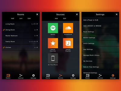
As mentioned in my second post, the primary navigation is narrowed down to 3 core functions.
The first, Rooms, is the lifeline to a user's SONOS hardware. Here you can view your list of room configurations, add more room configurations if you've purchases additional speakers, join rooms together as indicated by the link icons (which means you can hear the same music in multiple rooms simultaneously), or edit (which would allow you to delete room configurations you may not have anymore). A neat additional bit of information is the denotation of each room's speaker configuration. Anyone who takes their audio seriously knows how important it is to have the right location for their speakers. Here 'L'=Left, 'R'=Right, 'C'=Center, and 'S'=Subwoofer.
Next is the Sources screen. Here a user can manage where they draw music from and which accounts they have attached to each source. There is the ability to add more sources to this list or 'edit' and remove sources.
Lastly there is your typical Settings screen. While there's nothing particularly complicated, new, or fancy about this experience, it is important that it remains organized and legible, which I believe I accomplished with my list styling used throughout the app.
Again, as always, comments, critique, and questions are welcome!

