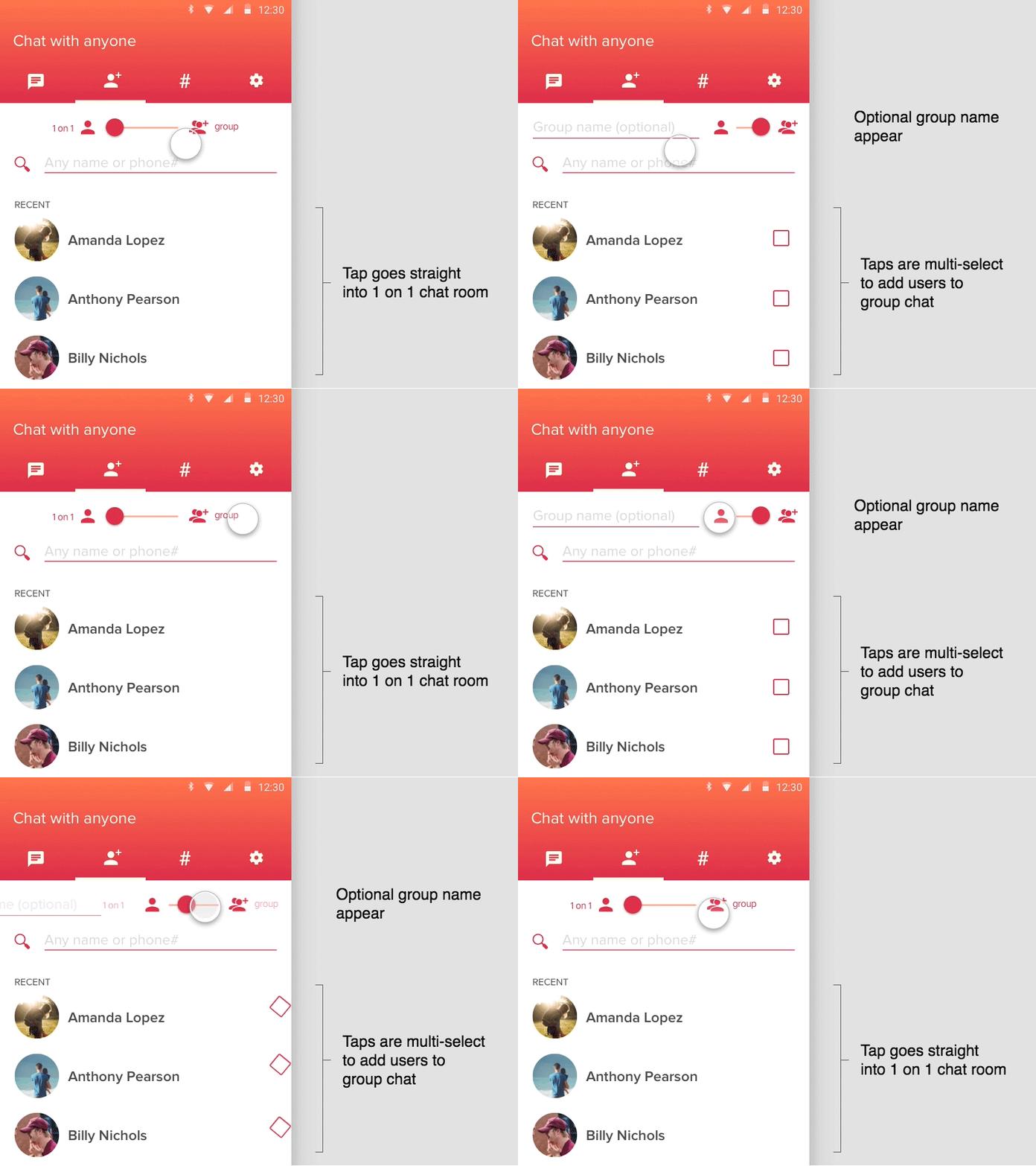
Group Toggle Redux - now with optional group name!
Here's another take on the toggle that also brings in an optional group name in multi-select mode, I'm fairly excited about the transition ;)
What do you think of using the slider toggle to switch between modes? Many other messengers use a completely new screen but the rest of the UI on the screen doesn't change. Thoughts? Suggestions? Critiques? Hit me.
More by Marc Greenberg View profile
Like

