VSCO Photo Description
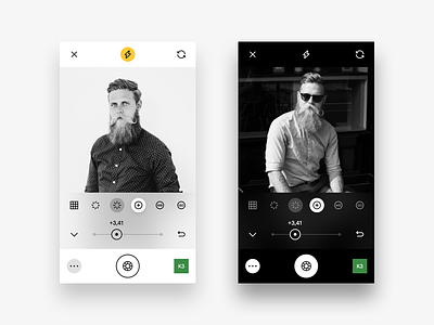
Hey! Another little piece of the VSCO app redesign that I'm doing.
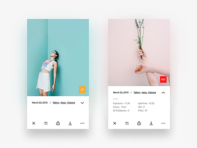
This time it's the description screens. Basically not much different from the current VSCO's approach, but I added a few things that I think are important for this particular screen.
Right now VSCO only offers you the date and the place of where the shot was taken. It's all right and almost always it's enough information to know. But I have gone further and added the ability to see more info about the shot taken.
For instance, you can see every Live Adjustment or Live Filter value that the photo was taken with. Obviously Live Adjustments like: (Exposure, Focus, W/B Balance, Aperture and ISO) you cannot change on the photo itself. You can adjust these settings while you're shooting but when the photo is taken - it's taken. The only thing in my concept you can change afterwhile is Filters. And I also displayed the filter line in the description and more importantly - I wanted to show the filter that the photo uses anyway, so I added a filter icon right on top of the photo, in the bottom right corner. I think it's convenient.
Hope you'll like today's UI and stay tuned for more updates and new shots about VSCO. Have a great day! 😜


