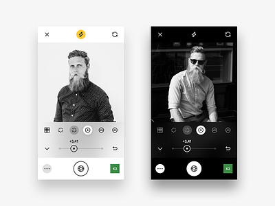
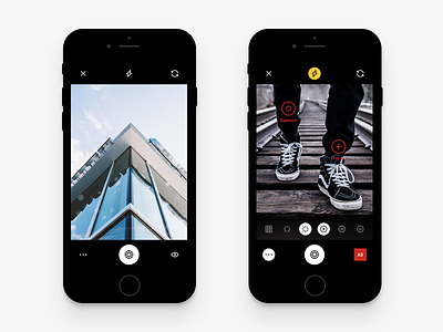
VSCO Camera Live Adjustments
Hey! Another little piece of my VSCO app redesign.
Yesterday on Twitter I posted a picture that shows the use of Live Adjustments in the Camera UI. But after a little while I thought some of the things looked wrong so I changed the bottom part and now it makes much more sense and not hiding the Camera interface at the bottom anymore.
Oh, and as you noticed this time I used a handsome @Tobias van Schneider ▲▲▲ photo for the showcase. He is one of my favorite designers with incredible style and great sense of humor. Make sure to follow him 😊
Hope you'll like today's UI and stay tuned for more updates and new shots about VSCO. Have a great day! 😜
More by Peppers View profile
Like


