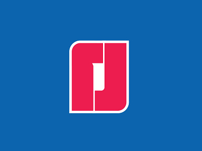
Reggie Jackson Logo Italicised

From looking at the previous version of Reggie's logo for awhile, it really started to feel too static. I decided to add a slight slope to create some movement.
I do like how pronounced/visible the '1' was in the previous version, though. It's not necessarily lost here, but not as obvious, I think.
This new version also has an unintentional Portland Trailblazers vibe because of the slope.