VSCO Photo Library
Hey guys!
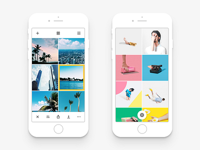
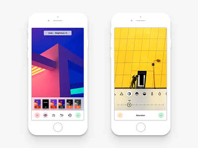
Sharing a little new piece of VSCO Redesign I am working on. This time it's the Photo Gallery screen. The screen where all the magic happens. These are not all the screens connected to the Photo Gallery, so expect a few more shots coming soon containing things like:
Share Menu
Sidebar
Grid View Change
Adding a Photo from the Library
More Actions
and so on...
Now, what was changed compared to the real VSCO app. I focused on two main things that were changed.
------------
1. Design and Colors
I say this each time I post a new piece about VSCO. It's really important to mention about the ability to have a light theme in my concept. I think this is one of the key features and this is what the app should have offered from the beginning. I also slightly changed the "selected photo" border color. Originally it was more greenish, but now the tone is more like yellowish or even orange. It looks brighter and is more distinguishable than before. Also photo previews now take all screen space without paddings like it was before the VSCO Version 5.0. This is a better touch in my opinion.
2. User Experience
Yeah. The most important part here is the convenience and clear interface. When I say clear, I mean understandable to anyone. Let me tell you why the current VSCO Photo Library UX is terrible.
First is the Top Bar. In the Photo Library they have two icons on top, which summon Import and the Filter Store. Import is important, yes, but the Filter Store is a useless information for a user and less valuable to put it on this screen. Users can always open the sidebar and go to Store to buy new filters. Right now VSCO lacks that sidebar icon which they had before the version 5.0. So I added it on top.
What else VSCO lacks right now is the ability to change the Grid Size right from the same screen. I added an icon for that on top and will also post the animation regarding that soon.
Now to the Bottom Bar. I left it almost the same, but changed a few things. First - I changed that confusing arrow icon that VSCO has right now. Me and everyone else always think it's a Share Button but actually what it does in VSCO 5.0. is Publish to VSCO profile. This is a terrible UX. I fixed that with a simple solution, how it should be. I did a combined Share menu that has all the social networks you need including the VSCO profile. This was you can always choose the right social network and not be confused by the icon. I also added the separate Save to Camera Roll icon to the Bottom Bar. In my opinion this is an important feature and deserves to be right there for a quick reach.
And last but not least is the Camera Button. I don't know what the VSCO guys were thinking about when they redesigned it to version 5.0. but they removed the most important button from the Photo Library - Camera Access. It is now done by swiping in the app and is really confusing, at least at the beginning. I brought the button back so nobody is confused ever again. It's there when no photos are selected from the list so the Bottom Bar doesn't cover it. I wanted to have it on top at first, but having four different icons there would be a mess, besides the Camera Button is the most important one so I decided to have it centred on the bottom. It has a round shape, the glyph represents the VSCO logo which is a camera shutter, and the button styling is inspired by Google's Material Design.
Obviously, elements go away when you start scrolling so nothing would interrupt you from exploring the gallery and choosing the right photos. I will show that more clearly with animations soon.
------------
Hope you're gonna like it and stay tuned for more updates and new shots about VSCO. Have a nice day! 😜


