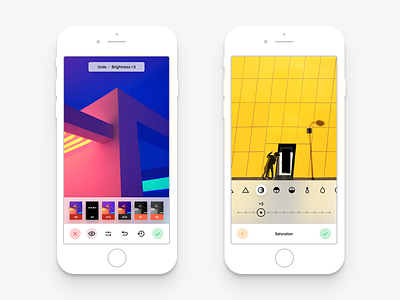
VSCO UI (Light)
Hey guys!
As you might remember, I started a challenge for myself to try my best at redesigning the current VSCO app as the current one is terrible.
I've been wanting this myself for a long time but VSCO never gave their users that. An option to change the app theme. Actually the brand works and looks better with a light (white) UI, so I made just that. But it's also important to have a huge contrast while editing your photos, so I also added a dark version.
Besides that I've been working my ass off to add features and changes to the design and user experience as much as possible to make the app concept very convenient to use. I've also fully changed the current iconography, making it a bit cleaner and harmonious. Oh, and look at that iOS style blur 😊
I've got a lot to cover yet and will share my progress with you very soon, so stay tuned!
The preview of the dark version is in the attachments. Check it out!
Have a nice day! ✌🏻


