VSCO Filter Editing Screen
Hey guys!
If you haven't already noticed, VSCO updated their app yesterday to version 5.0. VSCO is a company I admire and I love and their photo editing app with tons of great filters. It is one of the best I've ever used.
But their recent redesign of the app is just terrible. Even after the update to 4.0 they have already confused millions of users with weird iconography. Many including myself wouldn't understand what those icons meant to be and what actions they did. But now with the version 5.0 the whole user experience of the app has gone wild. I don't understand how to interact with the app, I don't understand how those weird gestures they introduced should help me navigate through the app. They've made everything even more confusing, settings less accessible and even the iconography less understandable again.
So I decided to try redesigning the whole VSCO app with all the controls, iconography, even simplify their current branding.
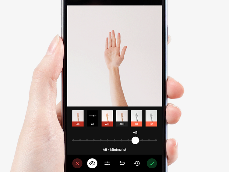
And here is the first screen for you to see. Choosing the filter / Editing filter screen. I got rid of that weird bottom bar with arrow that always asked you to swipe up just to Accept or Decline the changes. This often caused the iOS Control Center to appear. That was a terrible user experience and I fixed it. Now Accept and Decline buttons are always accessible on the sides of the bottom panel, red and green. They can also have many levels, for example you are changing the opacity of the selected filter and suddenly you decide you don't want that and decline the opacity change. The opacity slider disappears but Accept and Decline are still there so you could do Accept or Decline all the changes made.
There will be even more screens uploaded soon, also in light mode that fits the branding even more so don't miss anything. I hope you'll like it. Have a nice week! 😉