Logo for DigitalOcean Project Page
In the previous iteration, I found a way to compress the looong wordmark into something more suited to smaller spaces. Just today, I had to make it still smaller - needing to find a way for it to fit into a measly 80px square. Hello next iteration!
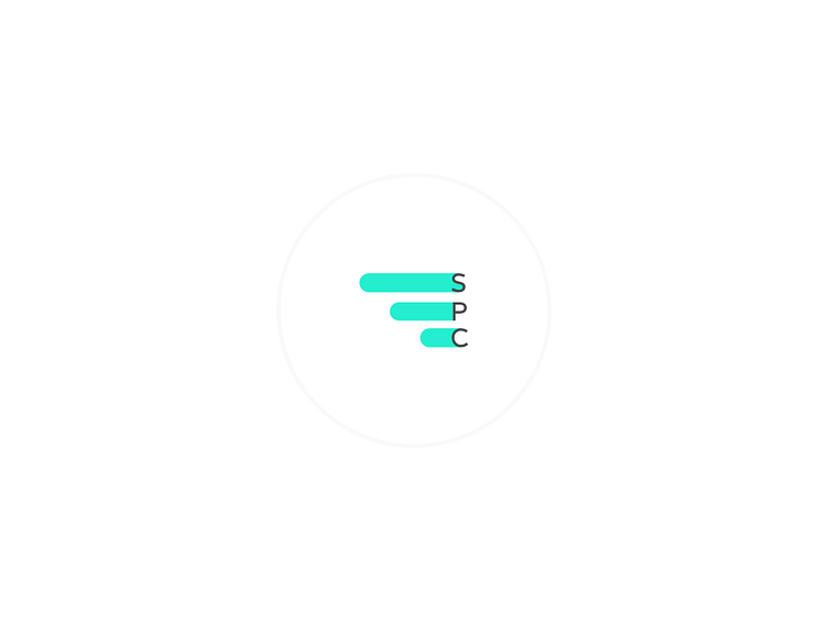
The wings are the key branding element, so they needed to stay. The wordmark and all those letters it contains are the element which needed to be twisted and turned. Ultimately, I settled on using the acronym often used to refer to the company, both internally and externally - SPC. However, the previous wings and their sharp right edge simply did not work in this small area; there was too much activity in the little space. After playing around with alignment for a bit, I decided to simply extend the wings into the characters to reduce the perceived amount of elements - thank you Gestalts - and really bring the piece together in a manner which lends itself to this small space.
To see it in all it's even tiny glory, check out: https://www.digitalocean.com/community/projects/stackpoint-io
I'm considering adapting the presentation to the previous iteration (see rebound) and using it more broadly. What do you think?