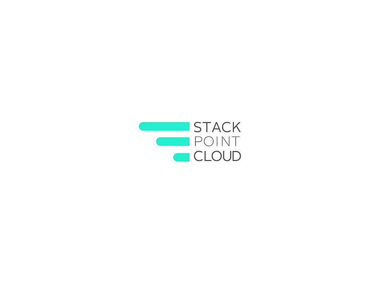
StackPointCloud Logo, Smaller Spaces
So, the startup now has a product and does some marketing. However, bootstrapped company marketing budgets don't allow for big spaces on sponsorship materials - a constraint!
This evolution of the logo is meant to address said constraint. For the wordmark, I used a shipping container as inspiration, attempting to approximate the dimensions. Why a shipping container? The company is focused on the microservices ecosystem; you know - Docker, Kubernetes, CoreOS, distributed computing, Cloud Native, etc. The wings have been given a splash of color - which is leveraged in the primary action buttons within the application.
Thus far, this logo has been used primarily in marketing materials. To see an instance of it in the wild, check out https://coreos.com/fest/