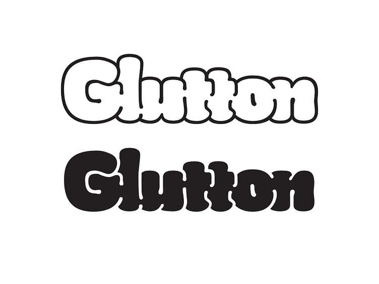
Glutton Bulges and Wiggle Lines
Taking in the feedback from Bobby McKenna (https://dribbble.com/bobbymckenna) and Josh Apostolopoulos (https://dribbble.com/JoshApos):
• Chopped out the tiny bit of the left side of the first /t to create a more intentional space between the the /u and /t.
• Increased legibility of the letters by extending the space lines between them
• Suggested letter differences with bulges to the stroke terminals in the /l, /u, and /n
• Increased letter suggestion with less heavy secondary strokes to define the shoulders of the /u and /n
• Added stroke direction to the counters of the /u and /n to increased legibility.
What do you guys think? Moving in the right direction?
More by Thomas Jockin View profile
Like

