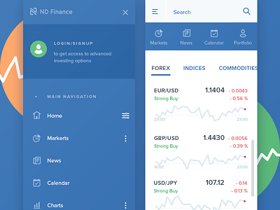
Mobile UI for Financial Website
Hello folks,
Sharing a small piece of what is like to work on the financial website. Especially if it's creating a delightful experience for mobile. Here you can find navigation pattern — quick links in the top navigation bar and more in-depth options on click on the menu icon in the top left corner.
I find it amusing that adding a bit of color makes finance less boring 😆
Have you work on financial interfaces as well? Do you like them? Would like to hear your stories 😉
More by Kohorta View profile
Like


