Financial Charts
Financial industry always seemed a complicated craft to me. And getting into it as a UX designer is even more challenging. But there is no place for fear. Challenges always bring new opportunities and self-improvement.
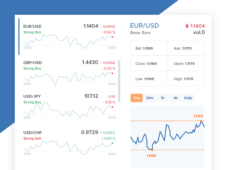
So here we go. A sneak peek of the financial website I'm working on. Surely, there were wireframes first but then we got such view of forex charts for the homepage. Where right column stands for more detailed view of each financial instrument from the left column. This works on hover showing more financial data to make decisions or dive into even more analysis.
If you have any thoughts on that, looking forward to it in the comments below 😊
Stay tuned to see more of it 😉 And have a great Friday, dribbble peers!