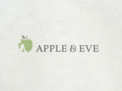
Apple & Eve Colour Logo
This final version shows the logo in colour, with an example of the paper stock that the stationery will be printed on etc.
Thanks to @RogieKing for basically telling me my previous choice of ampersand 'sucked', we now have a nice new ampersand based on Meno Bold. :)
Logo process post on my blog if anyone is interested : Apple & Eve Logo Process Post
Awesome project, made so much better through the constructive comments here on Dribbble
More by Smitho.graphics℠ — Logo & Icon Design Studio View profile
Like

