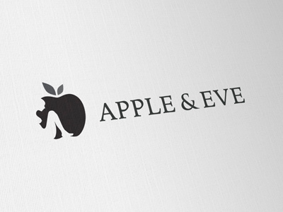
Apple Eve Logo [Final]
This should be close to final artwork now. Took some of the previous comments to heart, such as looking at fonts and also cleaning up the vector work in the apple and 'Eve'.
If you still feel aspects look 'odd/wrong' please let me know, I am VERY open to thoughts and views. :)
So have used a slightly heavier font, previous was too thin and open when sat next to the heavy Apple. The ampersand is a 'custom' tweak. Also raised the wording up from the Apples baseline for possible tag line.
Have tweaked the shape of the Apple, less pronounced curves top and bottom, to further move away from 'Apple Inc' logo. The human form has also been tweaked, neck, breasts and legs. Slight repositioning of the leaves as well.
More by Smitho.graphics℠ — Logo & Icon Design Studio View profile
Like

