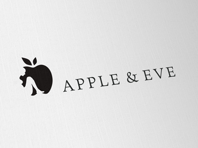
Apple & Eve Logo
So quite different from the original design, reason being a revised brief. Basic structure complete, but need some tweaks to the human form and also look at some 'Apple' variations.
It is still a company that provides visual communication advice, but it's focus is on style advice for women.
"Workshops how appearance can get you customers, how to exploit women’s curves to your advantage (all from a woman’s point of view).
Communication will have references to the Adam & Eve story but told backwards (what if Adam bit the apple, what if the snake was right...)"
So my idea is to provide a much more stylish and classy solution. After playing with countless variations of the female form, standing sitting, curled up, variations and combination of Apple and figure, I came to this idea of a rather poignant look.
A lone women, Eve, just sitting down. Subtle reference to a fetal position to give it that 'soft natural' feel. An element of independence, but without too much bravado or dominance. Possibly a position of thought and reflection but also confidence.
Did play with adding a fig leaf to the right side, the leaf forming a bite mark, but felt this was too much. Eve is the women and the apple is the apple, I feel all the references you need.
Interesting challenge to create a naked form that does not alienate or offend, but creates just the right feel and association to the natural biblical aspect, but not hiding the female form completely.

