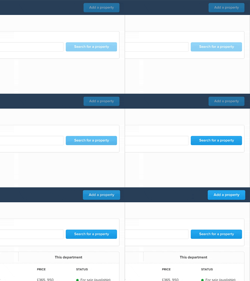
Add a property button (bounce affect)
**poor quality GIF, see the Framer prototype for a better quality and interactive version.**
In my last shot I was attempting to create better affordances in our current UI, and created a Framer prototype demonstrating how this might look.
Essentially, it was a visual cue to hint to users that, once they had searched for a property, they were then allowed to add one. It was previously a shake affect, which I felt was too negative, giving the impression that something had gone wrong. Here is an updated prototype with the new subtle, pulsating affect.
*Thanks to a recommendation by Igor on Design+Code Facebook group.
More by Dan View profile
Like


