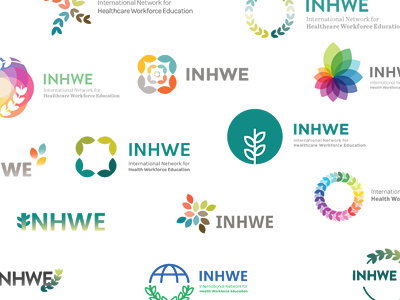
INHWE Logo
This is the final concept.
The client and I agreed to drop the abbreviation so not to overcrowd the logo. I experimented with using Fira Sans, Franklin Gothic and Poppins for the typeface but I felt Karla had the right amount of modernity and friendliness the logo required.
Interestingly, this wasn't my favourite concept but my client's knowledge of the industry was far greater than mine so he vetoed my favourite concept as it reminded him of another prolific organisation. Goes to show, sometimes the designer doesn't always know best!
More by Katherine Cory View profile
Like

