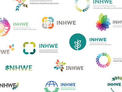
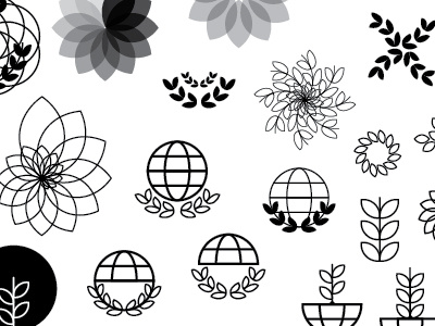
INHWE Logo Concepts WIP
After I've experimented in black and white, I tend to add colour and typography to bring the logos to life.
The client wanted to try and combine the abbreviation and organisation name, which was a challenge to say the least! I also had the brief of bright colours to stand out in the healthcare/pharmaceutical industry so I played around with really bright colour palettes and colours that could represent a globe or leafs, as well as more organic, earthy tones.
Throughout, I tried to stick to sans serif typefaces to keep the logo bold and modern.
More by Katherine Cory View profile
Like


