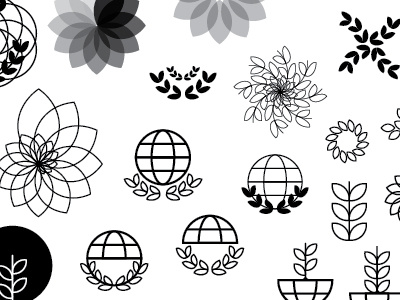
INHWE Mark WIP
Another example of my artboard for a new branding project; INHWE is the International Network for Healthcare Workforce Education and is a new start-up organisation. My brief was to create a colourful, bold and stylish logo around the idea of networks, meetings and the world.
When I start a branding project I tend to work in black and white and play around with shapes to see what sticks. I often find if something works in black and white, then it will work in colour. The client, David suggested the idea of an olive branch and I liked how it could symbolise the peace and caring side to the organisation and Healthcare industry so I experimented with a branch and an individual leaf, trying to combine it with a globe for an international meaning.

