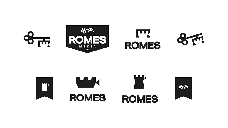
ROMES Media - Logo System
The concept here was to focus on the “kingdom” language that the client reiterated throughout the design brief. I wanted to create something that was subtle enough that it didn’t scream medieval castles or knights, but that included enough kingdom imagery that it could tell a story.
The watch tower elements obviously call to this, as do the banners used in some of the secondary marks, signifying that ROMES Media Co is part of kingdom expansion on this side of eternity.
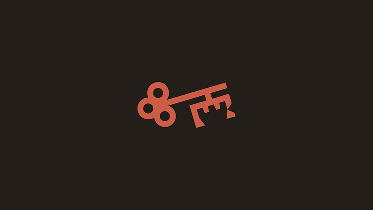
The key is a medieval heraldic symbol that represents dominion which fits nicely into this theme as well. The key also made for some unique iconography and use of negative space in the bit or teeth of the key.
The top of the watch tower, accompanied by the small triangle, loosely represents a video camera as well, the triangle being the lens of said camera. This is reminiscent of retro icons of production cameras.